")


BreezingForms 1.6.5 introduces the ability to select and customize themes for forms. This feature is only available in QuickMode.
PLEASE NOTE: BreezingForms 1.8.4 introduces native bootstrap support as well. If you want bootstrap themes instead of the standard theme engine, then please skip this tutorial and use either the default theme (that picks your site template's css) or create you own custom theme located in /media/breezingforms/themes-bootstrap/
Since BreezingForms 1.8.7 build 899, Bootstrap3 is supported, as well. You can skip the below if your template is using Bootstrap3. Simply go to your form => advanced tab => choose the Bootstrap theming engine and select "Use Bootstrap3". Additionally, turn off "Use built-in Bootstrap3" as this will make sure your website template's CSS will be used.
Additionally, you can create your own Bootstrap3 based themes. Those should be copied into /media/breezingforms/themes-bootstrap3/.
Tutorial introduction: Themes
Currently, QuickMode provides various built-in themes and many additional ones that need to be installed seperatly. The 2 most basic themes are: qmtheme, a clean, light-blue theme, and Default, which has no color scheme. Both themes can be easily customized via CSS.
Themes can be found on the tab Advanced, under Other Options > Theme.
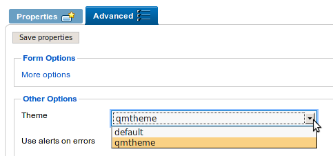
Picture showing the theme selector in QuickMode
1. Creating Themes
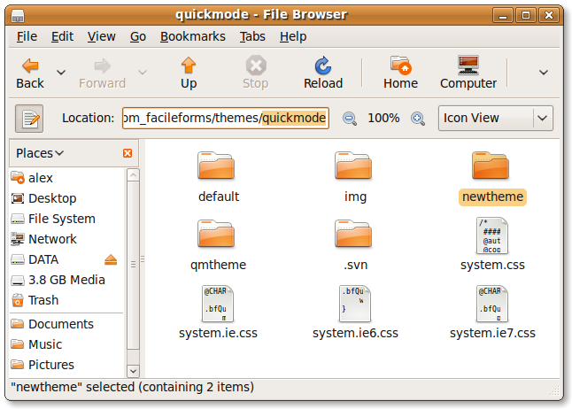
Themes are located in media/breezingforms/themes (in builds before 754: components/com_breezingforms/themes/quickmode) of your BreezingForms installation. To create a new theme, simply copy the "default" theme folder and paste it in the same themes/ (in builds before 754: themes/quickmode) directory.
In the example below, the new theme folder has been renamed to "newtheme".
Important: Back up your themes when updating or reinstalling BreezingForms.
2. Styling themes
Styling elements using CSS
A basic knowledge of CSS in recommended in order to follow this step. If you're not familiar with CSS, take a time to learn about it here.
Each QuickMode theme has an external style sheet called theme.css located in media/breezingforms/themes/theme_name/theme.css ( in builds before 754: components/com_breezingforms/themes/quickmode/theme_name/theme.css). With this file, you can control several aspects of a form design.
In this example, a different color scheme will be used for "newtheme". The CSS selectors of the main form elements and their respective properties are represented below:
Fieldsets
The box around the related form elements.
.bfQuickMode fieldset {
    padding: 10px 10px 0px 10px;
    border: 1px solid #dfe5c1;
    margin: 0px 0px 10px 0px;
    width: auto;
    -moz-border-radius: 5px;
    -webkit-border-radius: 5px;
   }
Legends
The caption for the fieldset element.
.bfQuickMode legend {
    padding: 5px;
    background: #bbdd98;
    color: #fff;
    font-size: 120%;
    border-radius: 5px;
    -moz-border-radius: 5px;
    -webkit-border-radius: 5px;
   }
Inline Legends
For legends of fieldsets inside other fieldsets.
.bfQuickMode fieldset fieldset legend {
    background: #fff;
    color: #bbdd98;
    font-size: 110%;
   }
Input fields and textareas
Input types/elements affected: text, password, select and textarea.
.bfQuickMode input[type=text], .bfQuickMode input[type=password], .bfQuickMode textarea, .bfQuickMode select
{ border: 1px solid #dfe5c1; padding: 2px; line-height: normal; }

.bfQuickMode textarea:hover, .bfQuickMode input[type=text]:hover, .bfQuickMode input[type=password]:hover, .bfQuickMode select:hover
{ border-color: #ace372; }

.bfQuickMode textarea:focus, .bfQuickMode input[type=text]:focus, .bfQuickMode input[type=password]:focus, .bfQuickMode select:focus
{ border-color: #759f48; outline: 2px solid #ace372; }
Form element backgrounds
<p> and <span> tags are used to wrap groups of legend and input.
.bfQuickMode p.bfElemWrap {
    padding: 5px;
    margin: 0px 0px 10px 0px;
    background: #f1fed6;
    border-radius: 5px;
    -moz-border-radius: 5px;
    -webkit-border-radius: 5px;
   }

   .bfQuickMode span.bfElemWrap {
    padding: 5px;
    background: #f1fed6;
    margin: 0px 10px 10px 0px;
    border-radius: 5px;
    -moz-border-radius: 5px;
    -webkit-border-radius: 5px;
   }
Buttons
This will change the appearance of any regular button in a form.
.bfQuickMode input[type=submit], .bfQuickMode input[type=reset]  {
    padding: 2px 5px 2px 5px;
    margin: 0px;
    outline: none;
    color: #fff;
    font-weight: bold;
    font-size: 100%;
    background: #6c8b2e;
    text-shadow:#000 0px 0px 2px;
    border: 1px solid #394918;
    border-radius: 5px;
    -moz-border-radius: 5px;
    -webkit-border-radius: 5px;
   }
Error Messages
.bfQuickMode .bfErrorMessage {
    background: #ffeded;
    font-weight: bold;
    float: none;
    display: block;
    color: red;
    border-radius: 5px;
    -moz-border-radius: 5px;
    -webkit-border-radius: 5px;
   }
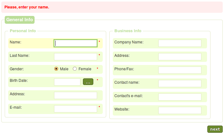
The new customized QuickMode theme.
Styling Elements in the Backend
QuickMode allows the customization of certain form elements directly in the backend. To customize an element, simply select one in the tree and in Element properties make the necessary changes.
The table below shows the types of element and their customizable attributes:
| Element Type | Customizable Attributes |
| Textfield | Value Size(Width) Max. length |
| Textarea | Value Width Height Max. length |
| Select-list | Width Height |
| Submit button | Value |
| Calendar | Value Size(Width) |
Example of customized element. Notice that the input Phone/Fax has had the attributes Value, Size and Max. length modified.
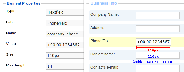
Note: Padding and borders may affect width calculations.
In qmtheme, form elements such as textfields and textareas have a 2px padding and 1px border by default. In the picture above, the width of Phone/Fax has been set to 110px. Therefore, the real width of Phone/Fax is 116px.