Try Something Else

Try this rock solid template. It's not just about eye candy but it's actually usable, stable, frequently updated and ships with a load of features, so your site will grow with your success!

Powerful Responsive Layout

A responsive layout adapts to the size of the viewing device, such as a desktop, smartphone or tablet, versus showing a separate layout.

Five Modes: Responses for phones, tablets & desktops.

Navigation: Basic select box menu system for smartphones.

Grid System: Responsive structure, up to 6 per row.

Support Classes: Visible & Hide classes for each response modes.

Grid System: Responsive structure, up to 6 per row.

Support Classes: Visible & Hide classes for each response modes.


Learn More

Custom Colors

Edit all the colors for this template to match with your corporate color scheme with a few click in the administration panel.

Use tools like Adobe Kuler to find the right color scheme for you if you are unsure and apply it to this template.

Learn More


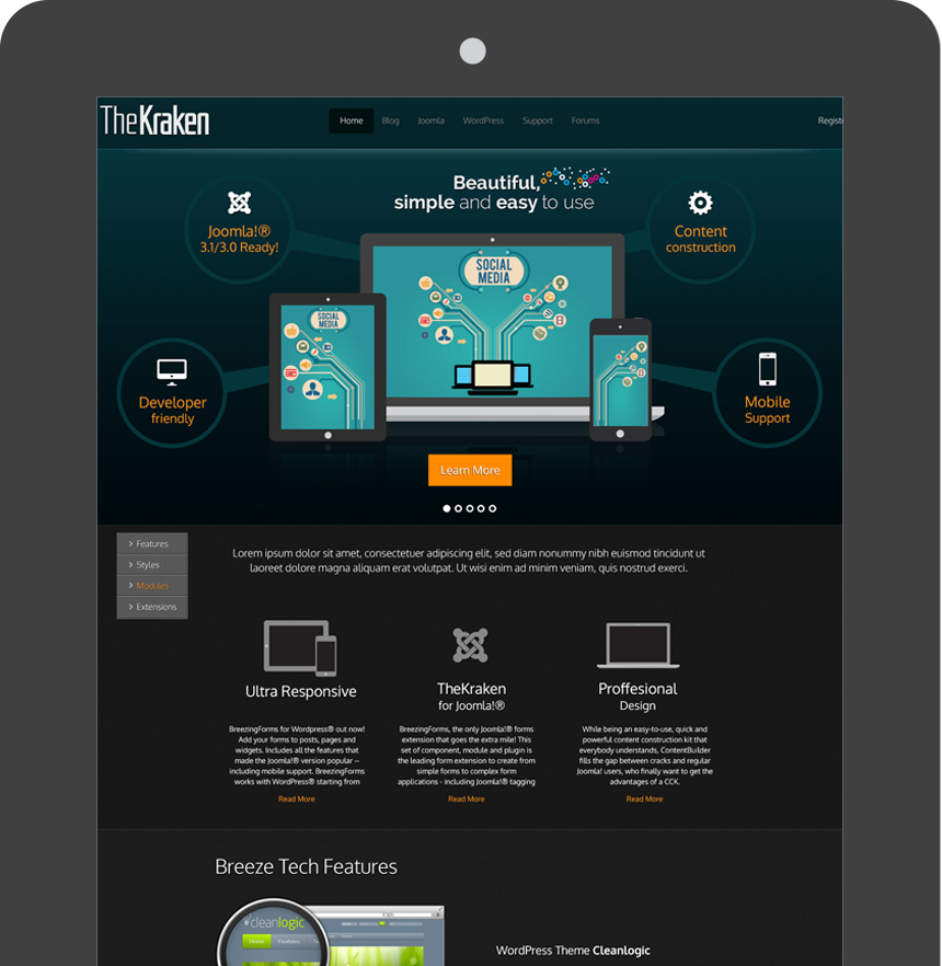
TheKraken introduces a selection of desirable features to its arsenal, such as a responsive layout.

TheKraken effectively offers several main features: custom colors, a unique slider, attention seeking bubble effects, a responsive layout and a great administrative interface.

The template is based on the best template framework out there called Gantry and gives you the advantage of years of professional template creation combined with crosstec's innovations.

Help & Guides

A rich resource of Video and Written tutorials are available at Gantry-Framework.org.

A rich resource of Video and Written tutorials are available.

Read More

More Features

  • Built-in Features
    Examples include font-sizer, Google PrettyPrint, Google Analytics, to-top slider.
  • 4 Column Mainbody:
    Up to 3 total sidebars with each column's location being configurable.
  • Flexible Parameters:
    Ability to set parameters via URL, Cookie, Session, Presets, etc.

Read More